Graphs
You can choose between four types of graphs:
- Environmental impact – in % compared to the starting year
Various environmental aspects (effects of emission of CO₂, NOₓ, CH₄, Particulate Matter, amount of waste, etc.) are included in this. - CO₂ emissions – in tons of CO₂
The CO₂ emissions of all items with a CO₂ factor. - Energy consumption – in MJ
The energy content of all purchased and self-generated energy (scope 1 and 2). - Waste mass – in kg
Only the weight of waste counts here. In the Environmental Impact graph, the recyclability of the separated waste flows is taken into account.
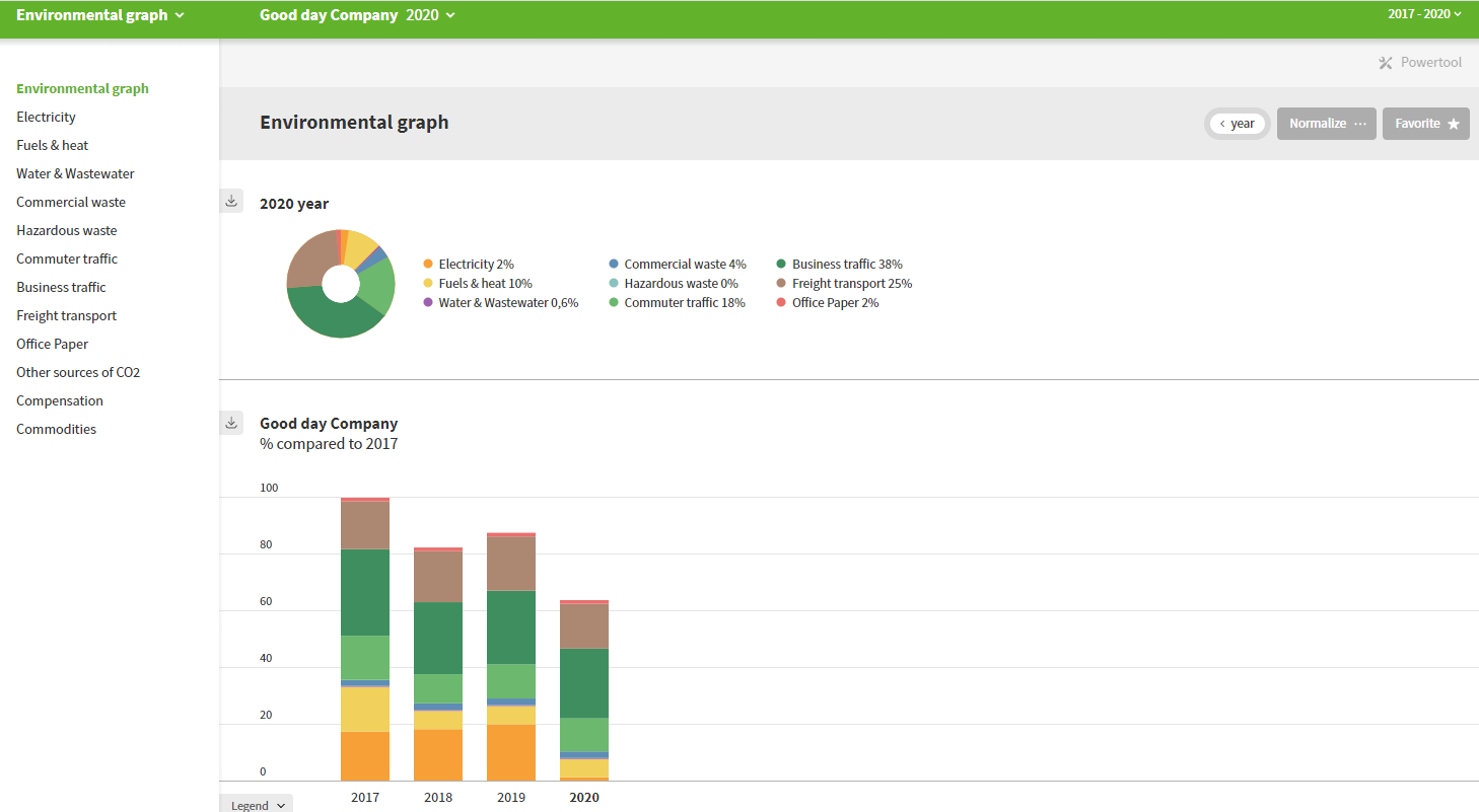
The graphs show the following:
- A pie chart with the selected year that shows the distribution of environmental impact/CO₂ emissions of the themes.
- A bar graph with the environmental impact or CO₂ footprint over the years plus any industry average next to it. The graph only shows the years selected in the time window.
- A goal graph if your organization has added a goal to this graph.
Edit the display
The following functions let you customize your graph:
- Normalize: To compare years/locations or with the industry average, you can normalize your graph (also referred to as ‘make relative’ or ‘graph per…’). For example: CO₂ emissions per employee (fte) or environmental impact per production (kg of printed products).
- Industry average: If you have normalized your graph, you can display the industry average (if available) next to your graph to compare the score. More information under benchmarks.
- Zoom in on a theme: Select a theme in the margin to view a graph for that theme with a breakdown of the environmental impact for all data entered.
- Goals: You can add a goal at the bottom of the bar graph. This links a goal to the height of the graph with the current settings. If a goal has already been added, the graph will be shown.
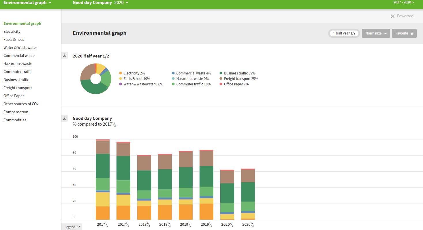
- Year parts: To the right of the graph title is a button that can be used to display the time period selected instead of the entire year. The bar graph will then show all time periods within the selected time window. The pie chart will then only show the selected time period. The view selector is set by default to semi-annual, but you can also choose to view by the four-month period, quarterly, monthly or remove this view option entirely. To adjust this, navigate to change barometer in the Envirometers management and use the ”period view” drop down menu. The image below shows a semi-annual display, with the first half of the year shown in the pie chart.
Tip: At the top of the page, a warning will appear if the ‘selected year’ (see green toolbar) does not fall within your selected time window. Change your time window if you also want to have the current year shown in the graph.
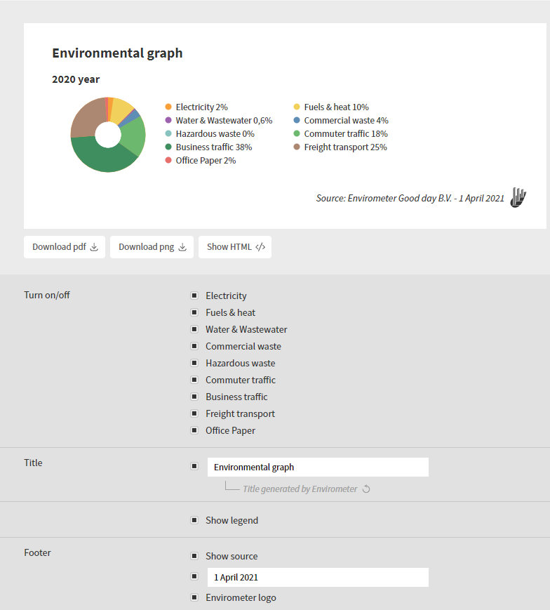
Download graphs
The grey arrow at the top left of every graph can be used to download that graph. There are numerous options available:
- Type of file: Choose between PNG, PDF and HTML.
- Title and Footer: You can add a title, source and/or data to the graph.
- Enable/disable: Select which themes or environmental items should be shown.
- Legend: Select the type of legend shown (no legend, with values per theme/environmental item or without values).
- Reset all: Can’t remember the original settings? You can return to the default settings at the bottom.
Copy years
You can copy a year if, for example, you want to:
- Check how this year’s data compares to last year’s data.
- Know the effect of an environmental measure on your Envirometer. You can try out the measures in the copy and then display the results next to each other.
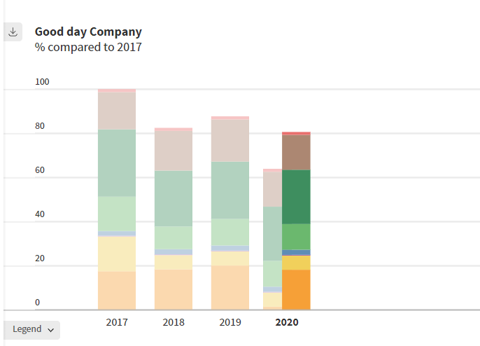
Copying a year means that the data entered for that year is entered into a new year or a variant of a year. When copying, you can define the specific data to be copied. You can copy a year via manage Envirometers.
A primary year will always be shown in a time window together with the other years in the graph. A copied year can only be viewed if you select the specific copied year in your Envirometer and will be shown as a ‘real’ year in addition to the other years, including the primary year. All ‘real’ years will be shown in a lighter shade in the graph to make clear that you are working with a copied year. An example is shown in the image below.
Please note: Waste is not visible by default in the CO₂ graph. See the help per theme for waste.
Powertool
If you have a subscription with multiple barometers (e.g. for different locations), you can use the powertool to create graphs in which you compare the barometers (with or without the industry average). The powertool is also useful if you have multiple copy years in your barometer (e.g. a copy with gray power for all years) and want to create a graph with the copies assuming grey power.