Powertool
Do you have a subscription with more barometers (eg. for different locations)? In that case you can use the powertool to make graphs that compare the different barometers (and the benchmarks). The powertool is also convenient if you have multiple copy-years in your barometer (eg. a copy with grey power for every year) and you want to display these in a graph.
The powertool is available for the CO₂‑ as well as the environmental graph. You will find the powertool button in the upper right corner of the graph pages.
- Use the refresh button in the center of the page to display a graph
- Select years:
- use the filters in the green toolbar: time window and labels to select a period or group of barometers.
- click on the name of the barometer to check or uncheck all years at once.
- (de)select individual years.
- You can select which themes you want to show in the graph. If you placed a benchmark next to your own graph, “All themes” means that the average of all themes is displayed in the graph (also if they are not present in your own barometer).
- You can only add a benchmark if you have normalized the graph (for instance on m² floor area).
- you can sort the graph by year or by barometer. For example, you can choose to put branches per year together in the graph, or all years per branch. You can find this option in the top left corner of the powertool.

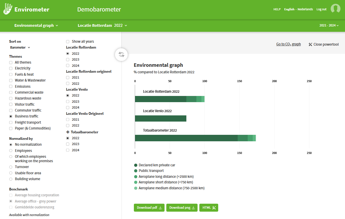
Powertool chart of one theme
Do you want to compare locations or years in the power tool on one theme, for example business traffic? Then select only that theme on the left and press the green refresh button. Just like the graph of one barometer, the graph is then split into the items contributing to that theme.
